This guide outlines the WeAre8 brand.
It includes logos (lockups and wordmarks), creative tools and design elements.
It is intended to allow the brand to be a clean canvas for creativity, whilst retaining recognition of key brand assets.
Please only use the brand elements found in these guidelines.
Do not use any WeAre8 brand elements taken from third-party sources.
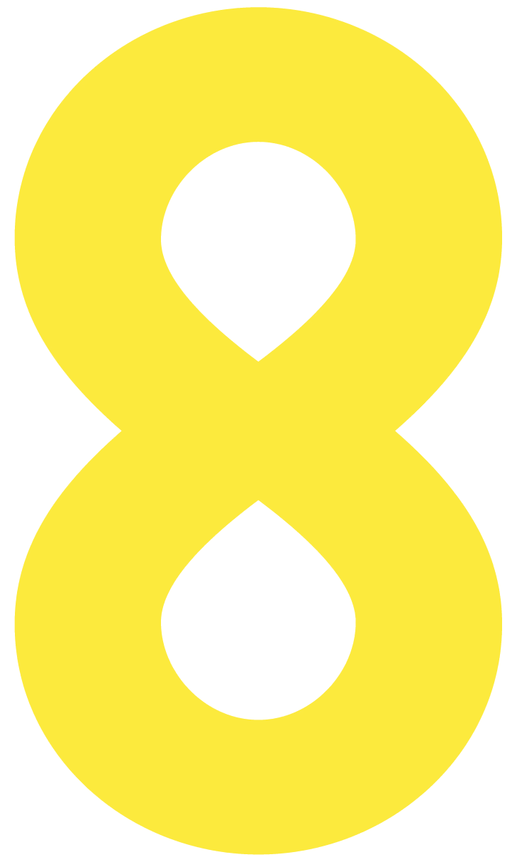
The 8 logo represents our community. It’s a badge of honour we wear with pride and reflects the infinite power of people and brands coming together to achieve collective action towards a better world.
Please do not alter, rotate, or modify any logo.

Our primary visual icon, our identity.

Our secondary visual icon. Use it when more context is needed to explain who we are.

A combination of our primary visual icon and wordmark. Use it when more context is needed to explain who we are and if there is space to do so.

An alternative to our secondary visual icon. Use it in together with brand partners and when the brand name is written in copy, for example, press releases, advertorials, online and print.
This is an alternative to our primary visual icon. Use it at scale on bold colours or over imagery.

This monochrome version of the app icon can be supplied to charity partners or brands to display alongside other social icons online.
Always use the official WeAre8 logo provided. Do not alter, recolour, or distort the logo in any way. Ensure the logo is clearly visible and legible. Avoid placing it on busy backgrounds that compromise its visibility. Maintain a clear space around the logo to protect its integrity. No other elements should intrude into this space.

1. Logo Variations:
● Use the primary logo version on white or light-coloured backgrounds.
● On dark or coloured backgrounds, use the white (inverted) logo version to ensure optimal visibility.
● If placing the logo on a coloured background, ensure it contrasts well and remains legible.
2. Logo Size and Proportion:
● The minimum size for digital use is 40 pixels in height to ensure clarity and legibility.
● Always maintain the logo's original aspect ratio. Do not stretch, squash, or modify the proportions of the logo.
3. Placement Recommendations:
● Ensure it is aligned consistently with other partner logos, maintaining equal visual weight and spacing.
4. Linking Instructions:
● The logo should link back to www.weare8.com or the specific campaign page if part of a collaborative effort.
5. Do's and Don'ts:
● Only use the provided high-resolution logo files (PNG or EPS formats).
● Maintain a sufficient margin around the logo for clear visibility.
● Don't alter the colours, fonts, or logo elements.
● Don't add any effects like shadows, gradients, or patterns.
6. Contact Information:
● For any questions or if you require alternative formats, please contact hello@weare8.com